Redesign project: MyFitnessPal refresh
Elevating the tracking experience for better goal attainment and nutrition visibility

Project Overview
Boosting the visibility of MyFitnessPal’s key features by 60% and reducing drop-off rates.
MyFitnessPal has long been a leader in fitness and nutrition tracking, but users today report mounting frustrations with core features like meal logging, nutrition goals, and its premium tools.
Over 3 months, our team conducted a thorough expert evaluation of MyFitnessPal to uncover where the experience breaks down and identified clear, actionable solutions focused on clarity, efficiency, and ease of use.
This redesign reduced task time, improved feature findability, and ultimately helped users build confidence and momentum within the app.



The Problem
Leading in downloads, yet lagging in usability
Tracking what you eat and how you progress should be easy, especially for users trying to build healthier habits.
Despite MyFitnessPal's popularity, many newcomers find the experience discouraging, as the app’s clunky experience turns simple tasks like meal logging or reviewing nutritional data into a challenge.
Expert Evaluation: Cognitive Walkthrough
The core tools work well, yet confusing flows and unclear navigation often overshadow their value
We used a cognitive walkthrough to evaluate how easily new users could complete key tasks like logging meals and checking nutrition info.
While MyFitnessPal’s core functionality is present, we found that inconsistent navigation, unclear CTAs and labels, and cluttered visuals often caused confusion.
The Market Landscape: Competitive Analysis
Falling behind while competitors continue to redefine the health and fitness space
By evaluating top direct competitors like Lose It!, MyPlate, and Alma alongside indirect habit leaders such as Strava, Headspace, and influencers like Duolingo, we uncovered how effortless logging, clear progress feedback, and playful motivation drive user engagement.
Tree Testing
Over 40% of users failed to successfully utilize the main feature: logging a food item
Through a tree test with 69 participants, we evaluated MyFitnessPal’s ability to support two essential tasks: logging a meal and checking macro goals.
These breakdowns revealed fundamental flaws in the app’s navigation and information hierarchy, directly informing our final redesign that prioritized clarity, visibility, and task-focused flows.
Task 1: Locate and record a salad for lunch

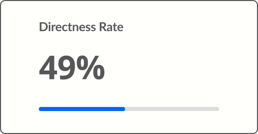
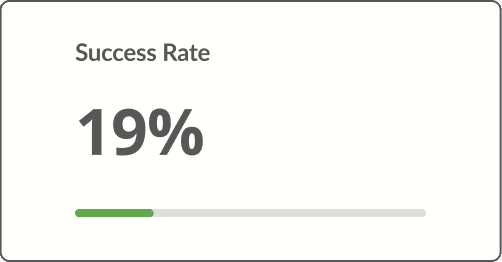
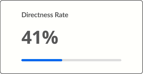
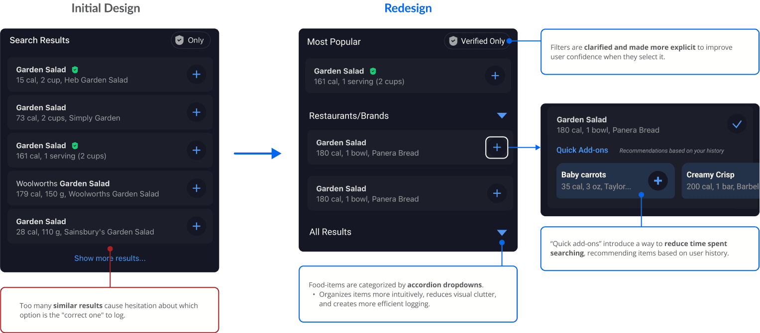
Just 59% of users were able to log a food item using search, and less than half did so directly. This suggests that cluttered results and duplicate or incorrect entries make meal selection overwhelming and reduce efficiency.
Qualitative Testing
"If I had not accidentally tapped on calories, I don't know if I would've found the [food's] nutrients section."
In an unmoderated think-aloud study with 15 participants, users were asked to log a meal and locate their nutrition intake goals. Their responses echoes several of the concerns revealed in previous evaluation methods.
"I wasn't too sure which [option] was the one that I was looking for...so I just had to guess and pick the best one."
— Participant quote during a task to log a food entry
The Redesign
Transforming meal logging, diary navigation, and premium trials
By triangulating evaluation methods, I lead the redesign of three areas to address our findings: meal logging flow, diary organization, and premium feature trials.
The updated logging flow reduced clutter by consolidating search results and introducing smart suggestions to help users log faster and with more confidence.
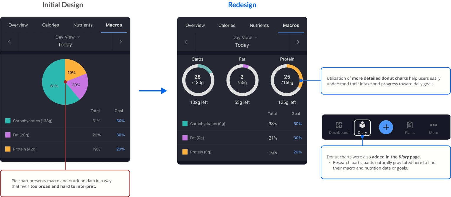
The diary was reorganized to surface nutrition goals in an updated donut-style format to reduce the need for guesswork.
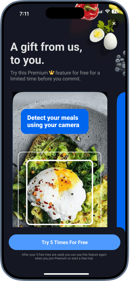
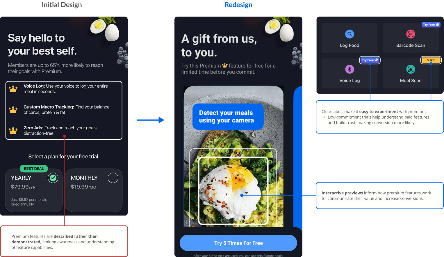
For Premium, I designed interactive previews that highlighted high-value features, like barcode scanning and quick-add meals, while making the upgrade path feel more transparent and optional.
1. Simplifying food logging search results
Clarifying macro goals and nutrition data
Demonstrating premium feature potential
Qualitative Usability Testing
Final tests yielded positive results with 39 participants logging meals 7 seconds faster
To validate the redesign directions informed by our tree testing and qualitative research, we conducted a final quantitative usability test to assess improvements in navigation clarity and task efficiency.
Overall, users completed the same tasks with higher success rates and reduced time on task compared to the initial testing phase.
Insights to Strategy: Final Recommendations
How MyFitnessPal can maintain its position — and reclaim its edge
1) Meal logging: clear and clean up
Organize food search results using accordion-style categories and reduce duplicate results. Introduce smart suggestions based on logging history to minimize manual input and speed up logging.
2) Macro & nutrition data transparency
Surface nutrition data directly within the Diary screen alongside the Nutrition page, using visual indicators like color-coded donut charts to make progress toward goals easier to understand at a glance.
3) Premium should pull, not push
Shift from constant upselling to value-driven discovery by offering limited, interactive previews of Premium features (e.g., free uses of voice logging). Clear "Free vs. Premium" labeling helps reduce disruption while maintaining trust.

